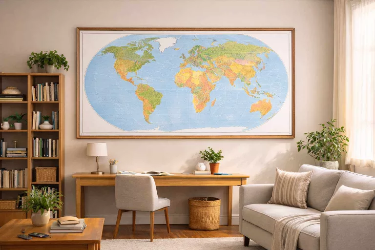
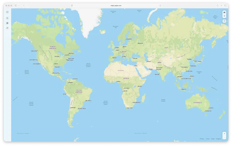
Walk into a classroom, office or hotel lobby almost anywhere in the world and you are likely to see the same familiar world map. It is usually based on the Mercator projection, a design created in 1569 for navigation at sea. While brilliant for its original purpose, Mercator gives a highly misleading picture of the world today. Nowhere is this distortion more striking than in Africa.
This article explains why Mercator distorts Africa, what that distortion looks like in practice, and how alternative map projections show the continent more accurately.
What the Mercator projection was designed to do
The Mercator projection was invented by Gerardus Mercator to help sailors navigate using a compass. Its key feature is that it preserves direction: a straight line on the map corresponds to a constant bearing in the real world.
To achieve this, Mercator stretches the map vertically as you move away from the Equator. The further north or south you go, the more exaggerated the scale becomes.
That design choice is the root of the problem.
Why Africa looks so small on Mercator maps
Africa sits across the Equator, where Mercator distortion is minimal. Europe and North America, however, are much farther north, where the projection dramatically enlarges land areas.
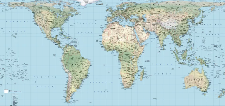
Mercator Map Projection (1569)
Equal Earth Map Projection (2018)

The result is a powerful visual illusion:
- Africa appears similar in size to Europe or North America
- Greenland looks comparable to Africa
- Northern countries dominate the map visually
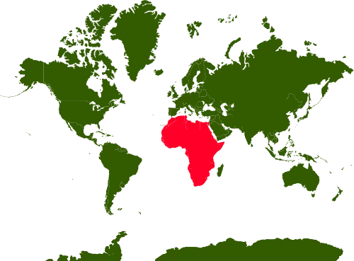
In reality, Africa is enormous. It can comfortably contain:
- The United States
- China
- India
- Most of Europe
all at the same time.
On a Mercator map, this true scale is completely lost.
How Mercator distortion increases with latitude

Mercator distortion increases exponentially as you move away from the Equator. This means:
- Countries near the Equator appear close to their real size
- Countries nearer the poles are hugely exaggerated
- The poles themselves can never be shown
Africa, being mostly tropical, is visually penalised, while Europe and North America are visually amplified. This is a mathematical effect, not a political one, but its consequences for perception are significant.
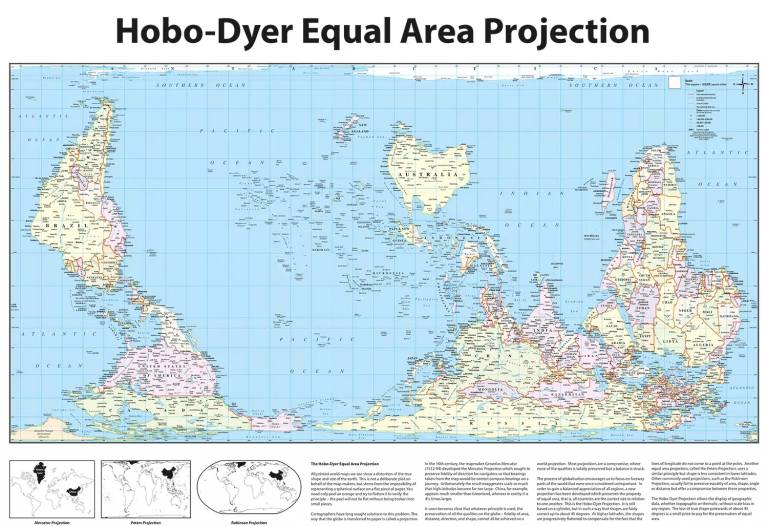
Better map projections for showing Africa accurately
If the goal is to understand the true size of Africa, equal-area projections are far more appropriate.
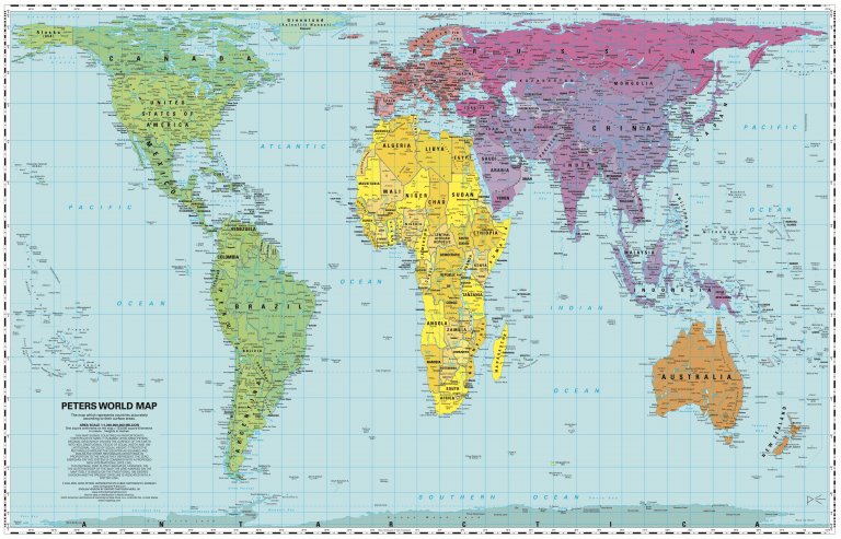
Common alternatives include:
- Peters projection – preserves area but distorts shapes
- Hobo-Dyer projection – an equal-area alternative with less visual bias
- Equal Earth projection – a modern compromise balancing area and shape
On these maps, Africa appears closer to its true dominance in global geography, reshaping how people understand the world at a glance.
Why this still matters today
Maps are not neutral. The Mercator projection continues to influence education, media and public spaces, reinforcing outdated ideas about which regions are “big” or “important”.
Seeing Africa at its correct scale:
- Improves geographic literacy
- Challenges inherited Eurocentric perspectives
- Helps organisations present global information more responsibly
For schools, offices and public buildings, projection choice is not just a design decision. It is a statement about accuracy and fairness.
Choosing the right world map
Mercator still has a role in navigation and certain technical uses. But for wall maps, teaching resources and visual communication, it is rarely the best choice.
If you want a map that shows Africa as it truly is, look for equal-area world maps that prioritise accuracy over familiarity. They may look different at first, but they tell a far more honest story about our planet.
Other Projections
Interested in other projections and how they compare? Head over to https://www.peters-projection-map.co.uk/projections.html.