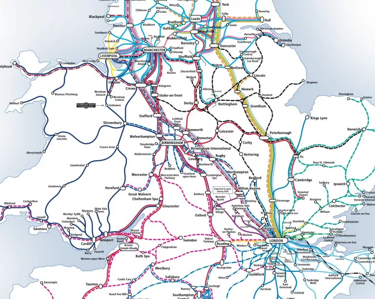
The London Tube map is one of the most recognisable pieces of graphic design in the world. More than a navigational tool, it has become a cultural icon, influencing map design, branding and visual communication far beyond public transport. Its journey from a complex geographic plan to a clean, abstract diagram is a story of innovation, practicality and design thinking ahead of its time.

Early Underground Maps: Geography First
When the London Underground first opened in 1863, maps were geographically accurate. Early designs attempted to show railways laid over real street layouts, rivers and districts. While informative, these maps quickly became cluttered as new lines were added. Central London grew dense with stations, making the maps difficult to read and even harder to use, especially underground where travellers needed clarity rather than geographic precision.
By the early 20th century, it was clear that a new approach was needed. The expanding network demanded a simpler, more intuitive way to guide passengers through the system.
Harry Beck and a Radical New Idea
The breakthrough came in 1933 with a design by Harry Beck, a technical draughtsman working for the Underground. Beck approached the problem not as a geographer, but as an engineer. Inspired by electrical circuit diagrams, he proposed that the map did not need to reflect real-world distances or directions. What mattered was the sequence of stations and how lines connected.
His design used straight lines, limited angles and evenly spaced stations, regardless of their actual location. Central London was enlarged, outer areas compressed, and the River Thames was simplified into a visual guide rather than a precise feature. Stations became dots, interchange points were emphasised, and clarity became the priority.
Initially rejected, Beck’s map was eventually trialled and proved an immediate success with passengers.
London Tube Map – Becoming the Standard
Following its popular reception, Beck’s diagram was adopted as the official map of the London Underground. Over time, refinements were made by designers such as Harold Hutchison, but the core principles remained intact.
Colour-coded lines, consistent typography and simplified geography became defining features. The map was no longer a literal representation of London but an abstract system designed for ease of use. This approach revolutionised transport mapping worldwide and has since been adopted by metro systems across the globe.
Evolution Without Reinvention
While the Tube map has changed over the decades to accommodate new lines, stations and accessibility information, its underlying structure has remained remarkably consistent. Additions such as the Docklands Light Railway, Overground and Elizabeth line have been integrated without compromising the diagram’s clarity.
Digital versions, interactive displays and printed posters all still rely on Beck’s original design logic. Even today, designers working on updates treat the map as a living system rather than a blank canvas.
Cultural Impact and Design Legacy
The Tube map’s influence extends far beyond transport. It is taught in design schools, referenced in branding projects and endlessly reimagined in art, fashion and advertising. Its success demonstrated that abstraction can communicate more effectively than realism when used thoughtfully.
Perhaps most importantly, it changed how people understand maps. The Tube map showed that accuracy of information does not always require geographic accuracy, a principle now central to modern information design.
A Timeless Piece of British Design
Nearly a century after its creation, the London Tube map remains a benchmark for clarity and usability. It is proof that great design solves real problems and stands the test of time.
From a simple diagram sketched by an engineer to a global design icon, the Tube map continues to guide millions of journeys while quietly shaping the way the world thinks about maps.
Get the very latest version of the London Tube map by their official partner, Pindar Creative.