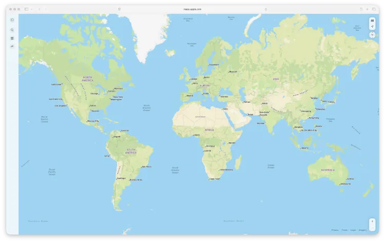
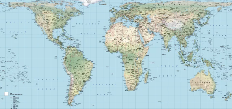
When you look at a typical world map, chances are it’s a Mercator projection. While widely used for centuries, the Mercator map severely distorts the size of landmasses, making countries near the poles appear much larger than those near the equator. This has shaped how generations have understood geography and, unfortunately, global power dynamics too.
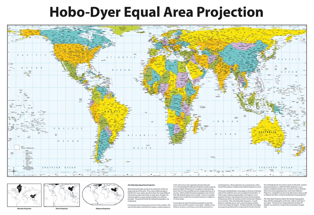
That’s where the Hobo-Dyer map comes in. As an equal area world map, it provides a fairer representation of our planet by showing countries in proportion to their true land area. At MapShop, we’re proud to stock both the Hobo-Dyer Equal Area Maps (Traditional) and the Hobo-Dyer Equal Area World Maps (Modern Design), two versions of this important alternative world map that challenge outdated perspectives.
The Problem with Traditional World Maps
The Mercator projection was designed in 1569 for navigation, not accuracy. While it made plotting straight-line sea routes easy, it exaggerated the size of Europe and North America while shrinking Africa, South America, and Asia.
For example:
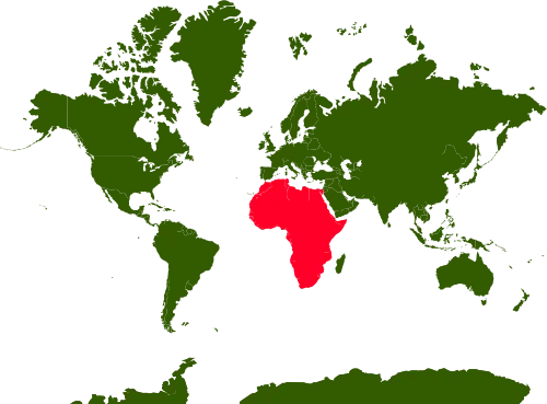
- Africa appears smaller than Greenland on the Mercator map, when in reality it is 14 times larger.
- South America looks tiny compared to Europe, though it’s actually more than twice the size.
These distortions go beyond cartography, they influence how we think about the world, often reinforcing Eurocentric or colonial biases.
What Makes the Hobo-Dyer Projection Different?
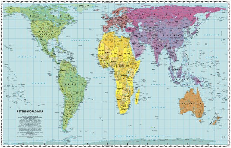
The Hobo-Dyer projection, first published in 2002, was designed by Mick Dyer and Bob Abramms of ODT, Inc., with technical input from Daniel R. H. Hobo. It is an equal area world map, which means every region is represented proportionally to its true size.
This projection builds on the Peters equal-area concept but improves upon it by reducing distortion in both size and shape. The result is a map that’s not only more accurate but also visually engaging.
Key features include:
- True Land Proportions: Africa, South America, and Asia take their rightful prominence, while Greenland and Europe appear closer to their real sizes.
- North-South Flexibility: The map can be displayed in the conventional north-up style or flipped south-up to challenge ingrained perspectives.
- Reduced Shape Distortion: Compared with the Peters projection, the Hobo-Dyer strikes a better balance between accurate land area and recognisable shapes.
Traditional vs Modern Hobo-Dyer Maps
At MapShop, we offer two distinct styles of this remarkable alternative world map:
- The traditional Hobo-Dyer Equal Area Maps stay true to the original 2002 design. They highlight the accurate relative sizes of countries and continents, while also inviting viewers to rethink the standard north-up orientation. These maps are excellent for classrooms and campaign settings where challenging global misconceptions is the goal.
- The modern design version offers a refreshed, contemporary look while retaining the same equal-area accuracy. Perfect for offices, homes, and public spaces, this updated design combines functionality with aesthetics making it as much a piece of art as a teaching tool.
Both versions are developed by ODT, Inc. and are built upon the Peters projection, but with improved balance and reduced distortion.
When you look at a typical world map, chances are it’s a Mercator projection. While widely used for centuries, the Mercator map severely distorts the size of landmasses, making countries near the poles appear much larger than those near the equator. This has shaped how generations have understood geography and, unfortunately, global power dynamics too.
That’s where the Hobo-Dyer map comes in. As an equal area world map, it provides a fairer representation of our planet by showing countries in proportion to their true land area. At MapShop, we’re proud to stock both the Hobo-Dyer Equal Area Maps (Traditional) and the Hobo-Dyer Equal Area World Maps (Modern Design), two versions of this important alternative world map that challenge outdated perspectives.
The Problem with Traditional World Maps
The Mercator projection was designed in 1569 for navigation, not accuracy. While it made plotting straight-line sea routes easy, it exaggerated the size of Europe and North America while shrinking Africa, South America, and Asia.
For example:
- Africa appears smaller than Greenland on the Mercator map, when in reality it is 14 times larger.
- South America looks tiny compared to Europe, though it’s actually more than twice the size.
These distortions go beyond cartography, they influence how we think about the world, often reinforcing Eurocentric or colonial biases.
What Makes the Hobo-Dyer Projection Different?
The Hobo-Dyer projection, first published in 2002, was designed by Mick Dyer and Bob Abramms of ODT, Inc., with technical input from Daniel R. H. Hobo. It is an equal area world map, which means every region is represented proportionally to its true size.
This projection builds on the Peters equal-area concept but improves upon it by reducing distortion in both size and shape. The result is a map that’s not only more accurate but also visually engaging.
Key features include:
- True Land Proportions: Africa, South America, and Asia take their rightful prominence, while Greenland and Europe appear closer to their real sizes.
- North-South Flexibility: The map can be displayed in the conventional north-up style or flipped south-up to challenge ingrained perspectives.
- Reduced Shape Distortion: Compared with the Peters projection, the Hobo-Dyer strikes a better balance between accurate land area and recognisable shapes.
Traditional vs Modern Hobo-Dyer Maps
At MapShop, we offer two distinct styles of this remarkable alternative world map:
- The traditional Hobo-Dyer Equal Area Maps stay true to the original 2002 design. They highlight the accurate relative sizes of countries and continents, while also inviting viewers to rethink the standard north-up orientation. These maps are excellent for classrooms and campaign settings where challenging global misconceptions is the goal.
- The modern design version offers a refreshed, contemporary look while retaining the same equal-area accuracy. Perfect for offices, homes, and public spaces, this updated design combines functionality with aesthetics making it as much a piece of art as a teaching tool.
Both versions are developed by ODT, Inc. and are built upon the Peters projection, but with improved balance and reduced distortion.
Why the Hobo-Dyer Map Matters
Choosing the Hobo-Dyer projection is about more than geography, it’s about perspective.
- For educators, it sparks critical discussions about fairness, inequality, and global representation.
- For campaigners, it challenges traditional narratives that overemphasise the global North.
- For individuals, it’s a bold and thought-provoking way to decorate a wall while starting meaningful conversations.
Whether in traditional or modern form, the Hobo-Dyer reminds us that maps are not neutral, they shape the way we view our world.
Discover Hobo-Dyer Maps at MapShop
If you’re looking for an equal area world map that offers both accuracy and impact, the Hobo-Dyer projection is an excellent choice. At MapShop, you’ll find:
- Hobo-Dyer Equal Area Maps (Traditional) – ideal for classrooms and campaign use.
- Hobo-Dyer Equal Area World Maps (Modern Design) – perfect for offices, homes, and contemporary spaces.
Browse our Hobo-Dyer map collection or explore the wider range on our website.
The Hobo-Dyer map shows us a world that’s more honest and more equitable. By choosing an alternative world map like this one, you’re not only correcting geographic distortions but also challenging cultural assumptions.
Whether you prefer the traditional version or the modern design, the Hobo-Dyer projection is a powerful reminder that how we see the world is often shaped by the maps we use.